If you’ve spent time browsing some of North Korea’s official websites and looked closely enough, you might have spotted a slight change in the typeface every time Kim Jong Il or Kim Il Sung is mentioned.
Your eyes are not deceiving you. Official North Korean websites contain a custom style rule written into the page that is used when either of the Kims is mentioned.
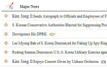
Here’s are some examples. First, from the website of KCNA. Kim Jong Il is mentioned twice and both times his name is slightly bigger than the rest of the text.
 At Voice of Korea it’s the same. The English page has slightly larger text but it’s best noticed on the Korean page, where the increase in font size makes the text look to be bolded.

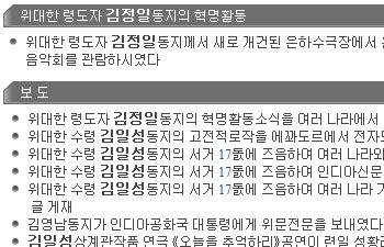
A quick check of the HTML code on the page confirms the difference and how it’s done:
Every time Kim Jong Il or Kim Il Sung is mentioned on the KCNA site, the “class” of the text is changed to one called “spanT”:
<span class='spanT'>Kim Jong Il</span> Sends Autograph to Officials and Employees of Fruit Farm
An entry in the site’s stylesheet, a web document that defines the text and layout of the page, specifies the difference for “spanT”:
spanT { font-size: 120%;}
So, the Kim’s names are defined as 20 percent larger than the regular text on the page.
On the website of the Voice of Korea radio station it’s done differently:
Short Biography of <FONT style='font-size:12pt'>Kim Jong Il</FONT>
The font size is defined as 12 point while the rest of the text is 10 point. But the result is the same. A larger font for Kim Jong Il’s name.

According to Wikipedia, the North Korean KPS 9566 character set includes “the logo of the Workers’ Party of Korea, uncircled and circled…and two groups of three special-purpose characters which spell out the names of the North Korean leaders Kim Il-sung and Kim Jong-il respectively, in a special decorative font”.
Thanks for the information! I’ll look into that.
that font thing is really crazy. http://i.imgur.com/5Fum2.jpg
I wonder if there are any spots or areas in NK’s daily life where the national party/leadership is not present?
Thank you. I had noticed this but had not looked behind the coding. Very interesting.
KCNA appears to not deem Kim Jong-un worthy of the larger font treatment. Yet another ‘signal’ to look out for in the succession process… 😉
@SP That’s pretty funny re: Kim Jong-un not yet being part of the special-font family.
In the 2014 version of the code set, the characters Kim Jong Un have been added.
Sorry, after more research, it was confirmed that that was the 2012 version.